
What Is a Crypto Heat Map? Read the Market in Seconds
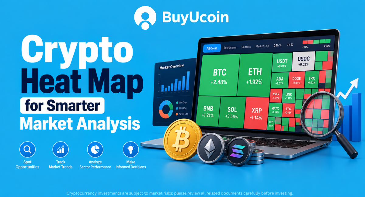
A crypto heat map is a visual market dashboard that uses the size and colour of boxes to summarise cryptocurrency data. In a conventional market heat map, a coin’s box is commonly sized by market capitalisation and coloured by price performance. A liquidation or liquidity heatmap answers a different question: where leveraged positions, resting orders, or estimated liquidation levels may be concentrated. Use a heat map to form a market view, not as a standalone buy or sell signal.
What Is a Crypto Heat Map?
A crypto heat map is a visual representation of cryptocurrency market data. Instead of reading hundreds of rows in a coin list, you can scan a single screen and quickly see which assets are large, which are moving, and how broad the market move is.
Most market-performance heatmaps use a treemap layout. Each coin appears as a rectangle, or tile. The tile’s area represents a selected measure such as market capitalisation, while its colour represents a selected measure such as the percentage change over 24 hours. Some tools allow the user to change these settings and view other data, including trading volume or different time periods.
The idea is simple but useful. If the largest tiles are green, large-cap assets are rising. If the largest tiles are red, the weakness may be broad rather than limited to small altcoins. If only small tiles are bright green, the market may be showing selective momentum instead of a broad rally.
A heat map is therefore a starting point for market analysis. It compresses a large amount of information into a visual snapshot, but it does not explain why a coin is moving or whether the move is likely to continue.
How Does a Cryptocurrency Heat Map Work?
A crypto currency heat map normally combines three elements:
The asset universe: the coins, tokens, sectors, exchanges, or trading pairs included in the view.
The size variable: the metric used to determine how large each tile appears.
The colour variable: the metric used to determine the tile’s shade or intensity.
For a basic coin market cap heatmap, the size variable is market capitalisation and the colour variable is price change. Market capitalisation is generally calculated as the current price multiplied by the circulating supply. The exact calculation and asset coverage can vary between providers, so always check the tool’s methodology when comparing platforms.
A practical heatmap workflow looks like this:
Start with the full market view.
Select a time period, such as 1 hour, 24 hours, 7 days, 30 days or your desired choice.
Check whether tiles are sized by market cap, volume, or another measure.
Note the colour of the largest assets first.
Look for confirmation in volume, price charts, market breadth, and news.
Open the individual coin page before making a decision.
Why Do Some Boxes in a Heat Map Look Large and Others Very Small?
The size of a box is not usually a direct signal that a coin is going up or down. It reflects the metric selected under Size by.
In a market-cap-based heatmap, a large Bitcoin or Ethereum tile means that the asset has a large share of the selected market-cap universe. A small tile means that the asset represents a smaller share of that universe. The box can remain large even when its price is falling because size and performance are separate variables.
Consider this simplified example:
Asset | Market-cap share in the selected view | 24-hour change | Visual interpretation |
Asset A | 45% | +2% | Large green tile; a large asset is rising |
Asset B | 20% | -3% | Medium red tile; a significant asset is weakening |
Asset C | 1% | +12% | Small bright-green tile; strong move in a smaller asset |
This distinction prevents a common mistake. A small bright-green box does not automatically represent a more important market move than a large, mildly green box. The price percentage may be larger, but the asset’s market weight may be much smaller.
What Do Red and Green Colours Mean? Does a Dark Colour Mean Something Different?
In a conventional performance heat map, green generally represents a positive price change and red generally represents a negative price change for the selected period. Neutral colours may represent little or no movement.
The intensity of the colour commonly represents the size of the movement:
A pale green tile may indicate a small gain.
A darker green tile may indicate a larger gain.
A pale red tile may indicate a small decline.
A darker red tile may indicate a larger decline.
However, the exact scale is tool-specific. One platform may use a fixed percentage range, while another may use a dynamic scale based on the visible assets. Some tools also offer colour-blind or monochrome modes. Read the legend before interpreting a dark tile.
Colour also changes meaning in other heatmap types. In a CoinGlass RSI Heatmap, the colour is related to the Relative Strength Index value rather than a simple daily gain or loss. In a liquidation heatmap, bright areas may represent a higher concentration or intensity of estimated liquidation levels. Red and green should never be interpreted without checking the title, legend, metric, and timeframe.
Crypto Heat Map Live: Is the Data Real-Time?
A crypto heat map live view can update as market prices change, but “live” does not always mean every value is tick-by-tick or identical across platforms.
The update experience depends on several factors:
The data provider and its exchange coverage.
Whether the displayed price is real-time, delayed, or aggregated.
The refresh interval of the page or chart.
The selected market, exchange, and trading pair.
The time required to calculate market capitalisation, volume, RSI, or liquidation estimates.
TradingView’s help documentation states that its heatmap is updated automatically every minute, while real-time symbol data can depend on the user’s data subscription. CoinMarketCap describes its market heatmap as providing real-time updates, but market-data definitions and coverage can still differ from another provider.
For a fast-moving market, treat the screen as a current snapshot with a timestamp, not as an eternal fact. If you are preparing an article or report, record the date and time of the observation. If you are trading, confirm the individual pair’s live chart and order-book conditions before acting.
Crypto Liquidity Heatmap: What Does It Show?
A crypto liquidity heatmap is designed to help visualise where buying and selling interest may be concentrated. Depending on the platform, it may draw from order-book depth, market depth, volume, open interest, or a model of potential liquidation levels. Liquidity matters because it affects execution. A market with deeper available orders may allow a larger trade to execute with less price impact. A thin market may move sharply when a relatively large order enters or exits.
A liquidity heatmap can help a trader ask better questions:
Are there visible areas of concentrated bids or asks?
Is the current price close to a large liquidity cluster?
Is the displayed liquidity persistent or disappearing as price approaches?
Does the order-book picture agree with volume and price action?
Is the chart showing actual resting orders or an estimated model?
Order-book liquidity is not guaranteed. Orders can be cancelled, moved, or filled. A heatmap should therefore be treated as a changing observation, not a promise that price will stop or reverse at a particular level.
Crypto Heatmap Liquidation: What Is a Liquidation Heatmap?
A crypto liquidation heatmap focuses on leveraged positions. When a trader uses leverage and the market moves sufficiently against the position, the exchange may forcibly close that position because the required margin is no longer available.
A liquidation heatmap attempts to show price areas where liquidations may be concentrated. CoinGlass explains that its liquidation heatmap uses market trading data, leverage usage, and related indicators to calculate liquidation risk across price ranges. The chart uses a colour gradient to display relative liquidation intensity.
The word estimated is important. A liquidation heatmap is not necessarily a complete list of every trader’s exact liquidation order. The displayed levels can be modelled from available market data, and actual liquidation amounts may differ from the visual intensity. CoinGlass explicitly describes the levels as relative intensity indicators rather than guaranteed realised amounts.
Liquidation clusters can matter because forced position closures may add momentum to an already fast move. A cascade can occur when one wave of liquidations pushes price further, triggering additional liquidations. This can create volatility in both directions.
BTC Liquidation Heatmap TradingView: What Should You Know?
Searches for “BTC liquidation heatmap TradingView” can refer to two different things:
TradingView’s native market and crypto heatmap features.
Community-created TradingView indicators that estimate liquidity or liquidation zones.
These are not automatically the same data product. Before using an indicator, check its author, calculation method, inputs, exchange coverage, and whether the displayed levels are historical, estimated, or derived from price and volume. An indicator can be useful for chart study, but its output should not be presented as an official exchange liquidation map unless the source supports that claim.
For Bitcoin analysis, compare any liquidation view with BTC price structure, open interest, funding, volume, and the actual derivatives venue being studied. A bright zone below the current price may indicate a potential area of interest, but it does not guarantee that price will visit it.
Crypto Heat Map TradingView: How to Read It Step by Step
TradingView’s Crypto Coins Heatmap provides a visual market view with controls for market capitalisation and percentage change. Its help documentation explains that the heatmap can be configured using Size by and Colour by settings.
Use it in this order:
Step 1: Choose the market universe
Decide whether you want the broad crypto market or a narrower group. A full-market view is useful for market breadth. A focused group can help you compare a sector or selected assets without smaller coins becoming visually insignificant.
Step 2: Select the size metric
Start with market capitalisation if you want to understand the relative weight of assets. Switch to volume if you are studying where activity is concentrated. Do not compare conclusions from two views without noting that the size variable changed.
Step 3: Select the colour metric
Daily percentage change is useful for a quick market pulse. A longer period can reduce the noise of one short session. Use the same timeframe when comparing assets.
Step 4: Read the largest tiles first
Large tiles show where the biggest market-cap weights sit. If these tiles broadly agree in colour, the market direction may be more widespread. If they disagree, the market may be rotating rather than moving as one group.
Step 5: Investigate outliers
A very bright tile can attract attention, but it is only a screening signal. Open the chart and check volume, liquidity, recent news, and the coin’s price history before concluding.
CoinGlass RSI Heatmap
The CoinGlass RSI Heatmap uses colour to display Relative Strength Index values across multiple cryptocurrencies. RSI is a momentum oscillator that compares the size of recent gains with recent losses over a selected calculation period.
A high RSI reading can indicate strong recent momentum and, in some contexts, an overbought condition. A low RSI reading can indicate weak momentum and, in some contexts, an oversold condition. Neither reading is a guaranteed reversal signal. Strong trends can remain at extreme RSI levels for longer than expected.
When using an RSI heatmap:
Confirm the timeframe and RSI period.
Compare RSI with the asset’s trend rather than reading it in isolation.
Check whether high RSI is supported by volume and market breadth.
Avoid treating “oversold” as an automatic buy instruction.
Use risk limits before entering a volatile trade.
Crypto Map Live vs. a Coin Heat Map
A coin heat map normally compares individual assets. A crypto market heat map may add market-cap groups, sectors, exchange data, or broader market statistics. A live crypto map may refer to a dashboard that refreshes prices, dominance, volume, or sentiment continuously.
Before comparing two dashboards, ask:
Are they using the same coins?
Are they using the same exchange or aggregated data?
Is the timeframe identical?
Is colour showing return, RSI, volume, volatility, or liquidation intensity?
Are the prices in USD, INR, or another quote currency?
These checks matter particularly for Indian users. An INR market page can show a different price and liquidity profile from a USD market page because of currency conversion, exchange depth, and local trading activity. BuyUcoin’s cryptocurrency prices in India page can be used to review INR-denominated asset prices and market information before moving from a global heatmap to a local trading context.
Top Crypto Heat Map and Market Visualisation Tools
The table below lists widely used crypto market visualisation tools and describes their publicly presented scope. It is not a ranking, endorsement, or statement that one platform is universally better than another. Features, coverage, refresh rates, and access conditions can change.
Tool | Main view or data type | Common size or display dimension | Common colour or analysis dimension | Timeframe or update note |
CoinMarketCap Crypto Heatmap | Broad cryptocurrency market performance | Relative asset size, commonly by market capitalisation | Price rise or fall over a selected period | Presented as a live market visualisation; verify the page timestamp and asset coverage |
TradingView Crypto Coins Heatmap | Crypto coins market overview | Market cap or another selectable size field | Percentage change, including 24-hour change | TradingView states that heatmaps update automatically every minute; real-time data may depend on subscription and symbol coverage |
CoinGlass RSI Heatmap | Momentum comparison across crypto assets | Tool-specific asset layout | RSI values represented through colour | Interpretation depends on the selected RSI settings and timeframe |
CoinGlass Liquidation Heatmap | Derivatives liquidation-risk visualisation | Chart-based price and time axes | Relative intensity of estimated liquidation levels | Available views can include multiple time periods; displayed levels are estimates rather than guaranteed realised amounts |
CoinGecko Charts | Global market-cap and market-statistics overview | Market-cap and chart-based asset presentation | Price, market-cap, volume, and change fields | Data scope and update timing depend on the selected chart and provider methodology |
How Traders Use a Heat Map to Plan Analysis
Traders typically use a heat map as a screening layer. It helps them decide which assets or market areas deserve closer chart analysis.
A disciplined process may look like this:
Form a market-breadth view. Check whether major assets and sectors are moving in the same direction.
Select a shortlist. Choose a few assets with meaningful volume and a clear reason for further study.
Open the price chart. Review trend, support, resistance, volatility, and timeframe alignment.
Check market quality. Look at spread, depth, volume, and the availability of the pair.
Use derivatives data carefully. Compare open interest, funding, and liquidation zones when relevant.
Define risk before entry. Decide position size, invalidation level, and maximum acceptable loss.
Review the thesis. If the heatmap changes because the market snapshot changes, reassess rather than reacting emotionally.
A real-world style example
Imagine that Bitcoin and Ethereum are large green tiles, while most large-cap altcoins are red. A quick conclusion that “the entire market is bullish” would be premature. The heatmap suggests leadership may be concentrated in two large assets rather than spread across the market.
A trader could then check BTC and ETH charts, compare volume, review BTC dominance, and inspect whether the altcoin weakness is linked to a specific sector or news event. The heatmap helped narrow the investigation; it did not make the trade decision.
A second example involves a bright-green small-cap tile. The colour shows a strong percentage move, but the small area signals a relatively small market-cap weight in the selected view. Before entering, the trader should check available liquidity, spread, trading volume, project news, and whether the movement is sustainable.
Pros of Using a Crypto Heat Map
It compresses a large market into a quick visual summary.
It helps beginners understand relative asset size and daily performance.
It can reveal broad market strength, weakness, or sector rotation.
It helps traders create a shortlist for deeper chart analysis.
It can make changes in momentum easier to notice than a long numerical table.
Specialised versions can add RSI, liquidity, or estimated liquidation context.
It can support portfolio monitoring when combined with individual asset research.
Cons and Limitations of a Crypto Heat Map
It can encourage decisions based on colour rather than evidence.
A bright colour may represent a short-term move that quickly reverses.
Small assets can show large percentage changes while remaining difficult to trade.
Market-cap size does not measure quality, safety, or future performance.
Data may be delayed, aggregated, incomplete, or different across providers.
Liquidity and liquidation heatmaps may use estimates or changing order-book data.
A heatmap usually does not explain the reason behind a price movement.
It cannot replace project research, financial planning, risk management, or tax advice.
How Beginners Can Use a Heat Map Without Overreacting
Beginners should start with a simple market-cap-and-performance view. Learn what size and colour mean before adding RSI, liquidity, or liquidation layers.
A sensible routine is to observe the same view for several days and record what happened afterwards. This teaches the difference between a useful market signal and a visually dramatic but short-lived move. Avoid switching tools, timeframes, and colour settings at the same time because that makes comparisons difficult.
For a local INR context, you can cross-check selected assets on BuyUcoin’s Bitcoin buying guide, Ethereum price page, or live cryptocurrency list. These pages are useful next steps after a heatmap identifies an asset for closer research. A heatmap should lead to questions, not remove the need for them.
Conclusion
A crypto heat map turns a crowded market into a visual starting point. It helps you see relative asset size, market breadth, performance, momentum, and—through specialised tools—possible liquidity or liquidation concentrations.
The most reliable approach is to read the legend first, separate size from colour, confirm the timeframe, and investigate the underlying asset before taking action. A heatmap can improve awareness and speed, but it is not a substitute for research or risk management. Crypto assets are volatile, and market-data tools do not remove that risk.
Frequently Asked Questions
What is the difference between a normal heat map and a liquidation heatmap?
A normal market heat map usually compares assets by size and performance. A liquidation heatmap focuses on price zones where leveraged positions may be liquidated. The first describes market movement across assets; the second describes potential derivatives-related pressure around price levels.
Is a crypto heat map live in real time?
Some crypto heatmaps update continuously or at regular intervals, but the exact timing depends on the provider, exchange coverage, subscription, and metric. “Live” does not guarantee tick-by-tick data. Check the platform’s update note and confirm an individual trading pair before acting.
What does “coin market cap heatmap” mean?
It usually means a treemap in which each coin’s tile is sized according to its market capitalisation and coloured according to a selected performance measure, such as 24-hour percentage change. The exact formula and included assets depend on the platform.
What does a crypto liquidity heatmap show?
It shows areas where liquidity may be concentrated. Depending on the tool, this can refer to order-book depth, volume, open interest, or estimated liquidation levels. It should not be treated as a guaranteed support, resistance, or execution level.
How do traders take trades after looking at a heat map?
They generally use it to shortlist assets or identify a broad market condition. They then confirm the idea with price structure, volume, liquidity, news, and risk controls. A responsible process defines position size and an invalidation level before entry.
Is a dark green tile always a buy signal?
No. A dark green tile only indicates a relatively strong positive reading under that tool’s colour scale and selected timeframe. The move may already be extended, illiquid, news-driven, or close to a reversal. Additional analysis is required.
Can a liquidation heatmap predict the exact next price?
No. It can display estimated concentrations of liquidation risk, but price may never reach those levels, and the actual liquidation amount may differ. Use it as context alongside price, volume, open interest, funding, and market depth.
What is the difference between a crypto heatmap and a crypto screener?
A heatmap is primarily a visual comparison of many assets. A screener is usually a filter-based interface that lets users set conditions such as price change, volume, market cap, or technical readings. Many platforms combine both approaches.
Should investors use heatmaps for long-term decisions?
Long-term investors can use heatmaps to monitor market breadth and portfolio context, but daily colour changes are usually too short-term to determine a long-term investment thesis. Fundamental research, allocation discipline, time horizon, and risk tolerance remain important.
Explore Crypto Markets and Continue Your Research
A useful market view is only the first step. Move from the heatmap to verified price data, the individual asset chart, liquidity checks, and a clearly defined trading plan.
- Create an account: Sign up on BuyUcoin
- Download the mobile app: Android app or iOS app
Educational note: This article is for general information and is not investment, financial, tax, or trading advice. Cryptocurrency investment is subject to market risk. Always verify current data, fees, availability, applicable rules, and product terms before making a transaction.